Patient Awareness Event v3.0
Scan time:
3 mins
Sector:
Healthcare
Role:
UX Design · UI Design
Client:
Abbott FreeStyle
Tools:
Figma · Adobe Photoshop
Context
What is a Patient Awareness Event?
PAE (Patient Awareness Event) is an event hosted by Sales Representatives (SR) and Healthcare Professionals (HCP) to attract potential customers to their flagship product – ‘FreeStyle Libre’. Free samples are given out at said events and are tracked using an app, however the system was outdated and needed to be modernised.What is the FreeStyle Libre product?
FreeStyle Libre is Abbott’s product that digitises the pricking of fingers for people with diabetes. Part of the product includes a sensor that’s attached to the arm, when scanned using a FreeStyle Libre reader or the FreeStyle LibreLink (FSLL) app, it will give instant and accurate glucose readings and help to avoid hypo/hyperglyceamic events.

The Challenge and Approach
Building a modernised and more accessible experience
PAE events have been running for years. What was once a paper-only system, moved to a more digital friendly environment native to iPads. Fast forward to 2020 and the app felt outdated and clunky.Fully digitised to further withstand time
We were tasked to fully modernise the existing app – creating a more user friendly flow, rid of all manual systems with the addition of new features to allow flexibility to all users and future events.Taking the lead
I took the lead of both UX and UI carrying out userflows, wireframing, aesthetics and prototyping but I worked closely with our strategist, project manager and developers to create a fully rigid system. When development started, I was at the forefront of bug testing.Revamping the UX/UI
Technically, because this is the third instalment of the app, half of the functionality was already built. Our approach for this version was focused on improving the app’s UX, increasing the flow with its new features and revamping the UI. We liaised with our client in focus groups in order to gain insight into user behaviours and used a Material Design UI kit to speed up the process in order to spend more time on its functionalities.

Tapping into user behaviours through focus groups
There were some problems we initially found through client-side focus groups. This allowed us to understand how current users behave, including their day-to-day routines.
 Lack of access to physical tech meant more manual processes
With the existing app designed solely for iPad and with limited accessiblity to tech, manual forms were still being used to fill the gap.
 Problems with Wi-Fi connectivity due to oversized and awkward venues
Clinics are essentially an empty room rented out in the back of large hospitals. Hosts needed an efficient way of collecting information without a connection.
 iPad only app made it tiresome to carry around and do admin between daily tasks
Users were sometimes inputting samples while ‘on the road’ – regularly carrying an iPad around became tiresome.
 Lack of app access for HCPs means relying on SR attendance
SRs have had to attend an event in order for HCPs to access clinic data and forms. If an SR could not attend, the event had to be cancelled.
Looking at problems from a new perspective
With these problems in mind, we were able to determine solutions that could increase efficiency and a new user experience.
 Build a PWA and leverage people’s personal mobile devices
Offering a PWA mobile first approach meant users could use their own phones, rendering manual paper forms redundant.
 Using PWA local storage feature to combat connection problems
Data could still be collected. Using a “Sync” feature, data could be sent from the central server once a connection has been acquired.
 Admin became more mobile, literally
With a mobile approach, users will be able to easily input their data while in between tasks without having to carry around an extra device.
 Limited access version for HCPs, allowing for flexibility
HCPs can only host events and collect patient data, however they can’t register other HCPs or samples directly. Having a HCP specific version meant they can host events without SR attendance.
 Edit feature allows less admin time and frustration
In the existing app, once a HCP has been registered or a clinic has been created, it cannot be edited. We found sometimes event details change, so an edit feature meant not having to delete and start over.
 Organised space for editing and data management
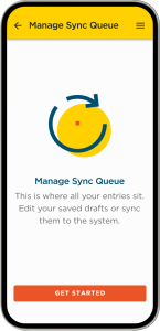
Users needed a space for managing their data and as stated above, a space to edit. Having this would give users the chance to organise their workload with efficiency.
 Data collection feature allows for brand growth
We found that SRs and HCPs often network within conferences and events. An opportunity arose for a data collection feature that could be used anytime, whether in a clinic or out. This would trigger an email marketing campaign which would see a new rise in potential customers and HCPs using/recommending the FreeStyle Libre product.
Drawing up a new framework
With our problems laid out on the table with probable solutions, we used Figma to structure content and flows for each user type and task. Doing so for each activity meant going into wireframing with a clear roadmap for each feature.


Wireframing brought life and function to the app
After getting approval on our userflows, I jumped straight into hi-fidelity wireframing to give our clients a detailed idea of how the app will work without committing too much to the UI in the event of early feedback.


Initial testing gave way to a clearer experience
I designed the initial draft and tested the designs with my team to see how our ideas worked in the real world. My design iterations were:
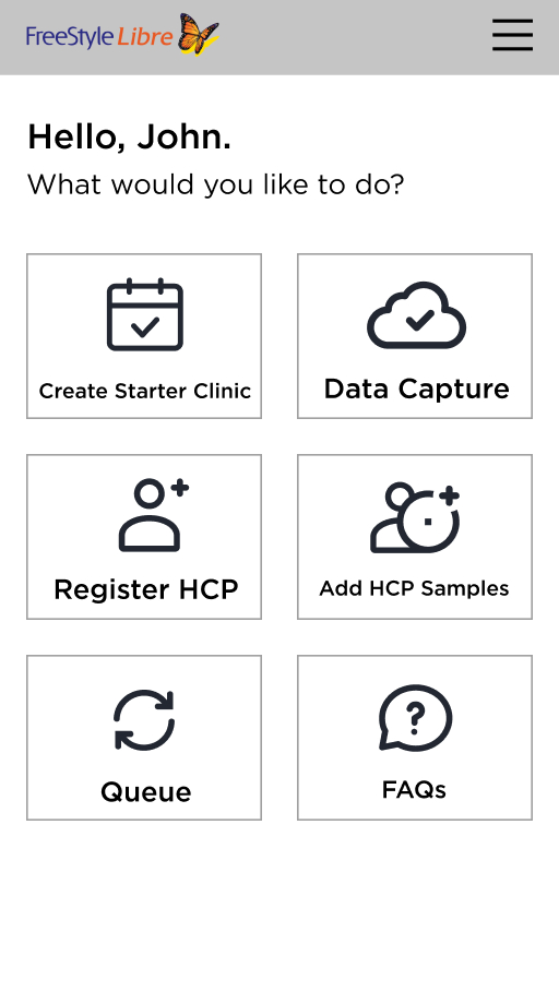
 Changes in naming conventions – so the homepage panels were clearer.
 Moving each onboarding task into their respective sections to reduce cognitive load.
Before we had a window appear that showcased each section at once, however most people forgot what to do once they got into accessing each feature.
 Changing the samples section to be more mobile friendly and intuitive.
We re-used the old UI to see how it would react on mobile, having a more honed-in UI increased cognitive load and made inputting sample a lot clearer.
From UX to UI
A simple and image-light UI made for less distractions and more usability
We knew this app was an internal tool, which wouldn’t be seen by much of the public eye and so we wanted to keep the UI simple and image-light – so as not to distract from the task at hand.Abiding by particular brand guidelines and avoiding clashes with app behaviours
We decided to keep the colour-scheme as yellow (this being their dominant colour and a must-have on every page) and their less common dark teal colour. The problem we found initially was a lot of their main brand colours can easily get confused with error/info state messaging. Yellow/teal allowed us to dodge most common app behaviours.

Employing powerful Figma components using a Material UI Kit to save time and resources
Because we spent a lot of time wireframing and fixing up userflows, we decided the best approach was adopting a Material Design UI Kit to save time. This also fell in line with using a PWA, which meant we didn’t have to spend more time designing natively for iOS. Utilising Figma’s power of components we were able to design efficiently. Abbott now have their own design system, but prior to that they had nothing – using the UI Kit, I utilised every component necessary and provided states, allowing our developer to know how our interaction design worked.

Icon sets for a custom look
I designed a set of custom icons in Adobe Illustrator for each section of the app, including the onboarding stage. Working quickly on paper first to get ideas, I digitised the ones I felt worked best. Once shown to the clients and any feedback implemented, I exported as SVGs for our devs to work with.A new way of managing samples
A key thing to mention here is we were tasked with not re-inventing the wheel and keeping the overall functionality, only make it intuitive and easy to use. This was because the actual cogs of the system behind the app still worked the same way.
Making sense of a complex inputting system
The nature of how samples are distributed is somewhat confusing:- You could add samples by inputting a pack’s ‘lot’ number, (a ‘lot’ meaning a batch of sensors made by the manufacturer) which have a certain number of sensors inside the pack.
- Inputting the lot number as well as how many individual sensors given out meant Abbott could track their stock levels.
- You have to assign samples to a FreeStyle Libre reader, which had a limit of 3 sensors per reader.
- You also have the option of adding them by taking a photo of the barcode of the sensor lot pack.

The first drafts
This design used a system that was essentially a step-by-step approach. Add a reader, along with sensors and move onto the next section. However through testing, there were some confusions.Initial testing gave way to a clearer experience
I designed the initial draft and tested the designs with my team to see how our ideas worked in the real world. My design iterations were:
 Adding in short-term reminders for easier recognition
We added in a banner at the top which states the order number and HCP name, as we found because of the amount of users they need to input, sometimes we need to double-check it’s the right person. This way users were reassured they were inputting samples to the correct person.
 Adding photos felt like an after-thought and we were missing a sensor only option
We learned HCPs also add in sensors in bulk in case users wanted to use the mobile app instead. with these two variable feedback in place, we needed a more direct access to add samples. A button at the top that actions a bottom sheet made choosing options a lot simpler.
 Text field to accomodate batch inputting
For adding in the number of samples, we simply used a text field in which users can simply type in. We found this was the easiest way for people to input their numbers.
 Icons for more visual clarity
Icons were added next to the option title, creating a clear visual seperation.
More features for better usability
An organised space for managing HCPs and samples
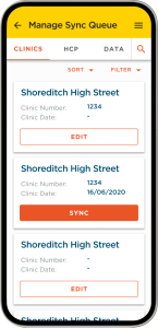
As stated at the beginning, this space was needed in order for users to manage their data. Split into three tabbed sections, you can edit and sync each entry depending on how many mandatory fields they’ve inputted. Additionally, because some HCPs might have seperate events in the same week, a sync button for each card means each individual HCP/event can be synced at the right time.A mobile and non-contact approach for events
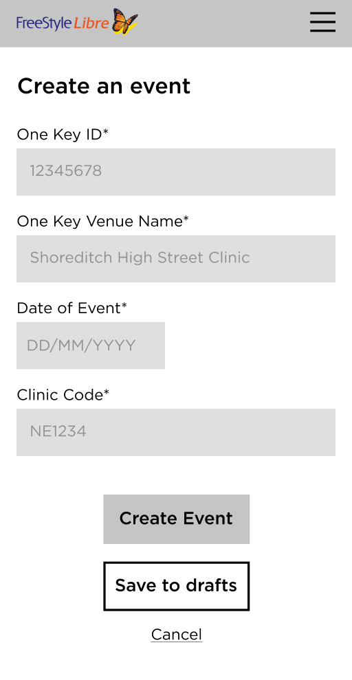
A QR code appears when launching an event, so anyone with a smartphone could scan it and access the form on their phone. This was the defining approach to move away from paper processes and a timely decision in COVID times. At the bottom of the form was a button to bring up the QR code again.
Stripped-back access for HCPs
This new flow allows first time access for HCPs who host events and collect patient data. The only thing we needed to do was strip down the features and content and allow basic access.Moving forward
PAE v3.0 has been my biggest design challenge to date and our client were overwhelmingly happy with how it turned out. The app however hasn’t been used that much yet, as in-person clinics took such a big impact over the COVID period. We are now pivoting to accomodate for the ‘new normal’ clinic procedures.
Learnings
This project was an amazing learning curve for me. It was my first time leading a project from the ground up and while I learned a lot design-wise, I enjoyed exploring all other aspects that came with leading a project, such as managing the different teams involved down to the running of meetings and creation of project management documents. Ultimately there were some failings that I learned from, some of these included:
 Keeping on top of the design system
At times it's easy to have forgotten a change was made while in the thick of it. This meant having to go back through the design and making sure those components are consistent and not too detached.
 Prioritising the technical specification
I realised we shouldn’t have been too relaxed on the technical specification just because there was a previous version built. Because a lot of the functionality had changed, we realised it should still have played a critical part in the design process when handing over to development.
 Testing early and more frequently
It’s easy to get caught up in a design process but testing more frequently can provide further clarity.
 Pushing back on client decisions when usability suffers
I found some decisions that clients suggest have to be pushed back on due to usability issues, providing evidence and proof of how certain decisions can be good/bad can really help fight a case.


