24SQ Website Re-design
Scan time:
1.5 mins
Sector:
Creative
Role:
Web Design · Prototyping
Client:
24SQ Digital Agency
Tools:
Figma · Adobe Suite · Asana · Miro
Context
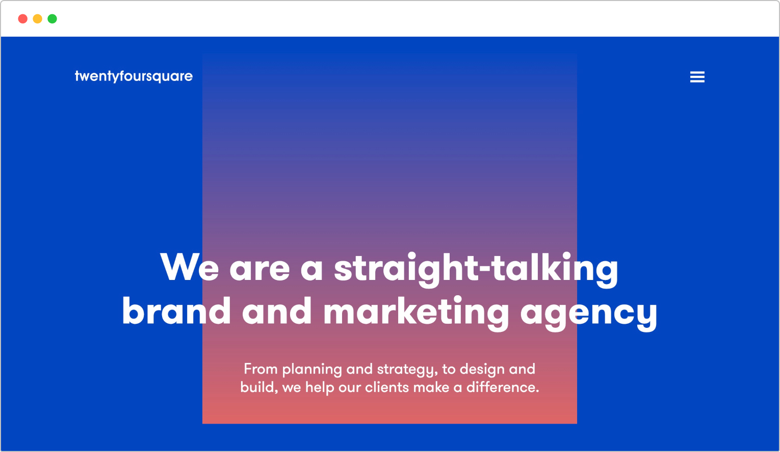
After a long time since the last major re-design to our website and after observing the current climate of the creative business, a lot of things have changed within the industry. Thus, a re-think to how we wanted to present ourselves was in need to attract the projects we truly want to work on, expand as an agency and compete against the ever rising tide of competitors.


The Challenge and Approach
Taking the lead on a project that requires thinking out the box
I was given the lead role on this project after showcasing some ideas that had a largely modern approach, something we really needed to focus on. Working closely with my whole team, we decided to create designs that elevated beyond just a static site and that required a large amount of development. We wanted something interactive, quick to load and that stood out.Working as a team to build a human tone-of-voice and visual identity, who are we?
After a long wait for a re-design, we needed a whole new approach to how we represent ourselves. Our strategist and copywriter went away and built the foundations of our messaging that would help give the design its core personality. Ultimately, we wanted something ‘human’.Appearing original to stand out in a sea of high-calibre talent
Being another agency in a sea of creativity, we had to think of something ‘original’, which is a loose term nowadays. Rather, we collected inspiration and tried to create new ideas based on existing designs.Not focusing too hard on building a brand, instead build an experience
Of course we needed a visual guideline but the most important thing was to create something that spoke to someone there and then. How engaging is the site? How are we peaking their interest? What does navigating the site look like? How easy is it to contact us?With a portfolio of projects consisting of limited creativity, this website became a portfolio piece
We realised the majority of the projects we have worked on previously weren’t creatively stimulating and not representative of the work we want to bring in, so we decided we needed to make special effort with our website, hence the engagement and boldness. Our website quickly became a statement of our portfolio – this is what we can do.Building on new tech, Framer
Another thing we really wanted to try was building on new web building tools that are clearly the way forward. WordPress was obviously a good option but it’s old and somewhat clunky. We optioned Webflow and Framer but found the bespoke build to be more intuitive on Framer, so we tried it!First off… Who are we? What do we stand for?
Before any design decisions take place, we sorted the tone of voice and built a summary
Our strategist and copywriter went away and built a foundation of copy, that would spur ideas of how we’d visualise ourselves. Reviewing what the current climate is, we already knew that the corporate speak was out, in with the more human touch.What were our values?
 Meticulously Fast
 Purposely Insightful
 Consciously Compact
Putting the client first, how do we build an experience?
What we say is important, but we focused on how we make them feel
We wanted something fun, memorable, concise and maybe even a little bit stupid. We are a light bunch after all! Adding in all the engaging animations, amusing touches but with a professional tone gave us an approach that felt like we’re fun to work with, trusting and hard-working.Researching design ideas with heavy interactive elements to showcase modern design ideas and drive engagement – in hindsight, less is more
We built a Miro board of existing examples to bounce ideas around and brainstorm what’s possible within our realms. What can we explore with? In hindsight, less is more = time saved and less indecisiveness. You can spend hours collecting amazing work, only to take inspiration from only a few pieces.Inspiration shown from Studio Sentempo, Serious Business, HAWRAF (since discontinued) and Debuut Studio.
Playing around with engagement ideas
The first thing we wanted to focus on was the initial engagement, what can the user do that’s interactive and fun? I knocked up quick ideas to present to my team that I thought might work well to get some interest right off the bat. I worked with a desktop size purely to get buy-in from my team, but all the while I was thinking mobile-first.

Making sure the experience includes accessibility and ease of use
We didn’t just focus on the excitement of the experience, we also wanted to provide a seamless one. Focusing on making things instantly and easily accessible allowed us to hopefully increase conversion. I designed a footer that allows a user to send an idea straight away, with an anchor link CTA higher up the page and placeholder text in the footer fields, I thought this would help the user in ‘zoning in’ to the contact section and decrease indecisive thinking.

Playing with variable type (coming soon!)
Variable type is the future, however animating proved more complex
Our idea of using variable type animations are in motion, however with our deadline along with other interactive elements, we’ve pushed the animations to Phase 2. Animating type using their variable axes seems easy to do, however getting the right movement with the axes available proved tricky. Our typeface ‘Fraunces’, has great options to animate, however we found getting that sweet spot harder than we thought. Additionally, using Framer as a web builder, we found it doesn’t allow for variable type in its CMS UI just yet, we can only use it when hard-coding. So using it as a header design for animation, fine. But using it throughout your site to also benefit from its efficient file size and management is actually counter-productive, purely because we still needed to use static font styles for our CMS components (which is pretty much everything). So, watch this space and roll on Phase 2!
A perfect solution… if you test animation axes early on
As mentioned above, variable type is the future, however it’s still early days. It’s rare to find a typeface that was interesting that didn’t cost us an arm and a leg. Most were very plain sans-serifs, limited styles and not enough axes to play around with for animating. I optioned the GT typefaces, but a $1,000 ballpark figure just for fonts went down as I had expected, not very well – despite showing their countless axes and their animated potential. Fraunces, however, still had a good few axes to choose from, was free and we learned valuable information with how to test it and how to use it on a live site. The lesson: heavily research your concepts before getting buy-in.Playing with variable type (coming soon!)
With limited imagery to play with, we focused on creating a type heavy experience
As mentioned before, our website became a part of our portfolio and we had limited imagery to use, therefore we decided that bold typography would play a heavy role in our design. Variable type is now largely accessible in browsers and driving innovation is always at the forefront of my ideas.
Variable type is the future, what can we do with it?
I was totally set on using variable type and jumped straight in. We wanted something interactive, so ideas of type animating on scroll or on hover sounded perfect. I researched examples of what can be done in CSS and got opinions from our developers.
Looking at some research, we got some ideas in:
A great typeface, not enough resource to properly test animations
We found a really nice typeface, ‘Fraunces’, which seemed to have all the personality and style that we wanted, on top of that it’s part of Google Fonts, which made it very cost-effective.
However, while everything was doable, we only had the original Fraunces website to go by to reference animations. Without immediate dev resources in a tight deadline, we couldn’t test exactly what we could do, therefore we put together basic animations to start with and hopefully more to come in phase 2.
A perfect solution… if you test animation axes early on
As mentioned above, variable type is the future, however it’s still early days. It’s rare to find a typeface that was interesting that didn’t cost us an arm and a leg. Most were very plain sans-serifs, limited styles and not enough axes to play around with for animating.
I optioned the GT typefaces, but a $1,000 ballpark figure just for fonts went down as I had expected, not very well – despite showing their countless axes and their animated potential. Fraunces, however, still had a good few axes to choose from, was free and we learned how to use and manage variable type on a live site.
The lesson: heavily research your concepts before getting buy-in.
Visualising the experience
An early mistake was made by focusing too much on the branding than the experience
Visualising how we show the experience was tough. We had a limited brief to follow with no real vision for how we wanted to show ourselves. I focused too hard on the branding and trying to get a visual identity going rather than providing an experience. I felt I struggled because of the lack of imagery of us as an agency and no real showreel yet created, so I started to tunnel vision. Focusing back on the experience allowed me to fill in the blanks of what felt like a blank canvas.Really pushing the boundaries, how disruptive do we take it?
The copy is in and we’ve got a typeface. The brief however was challenging. We wanted bold and disruptive, the kind that piques interest. Neon colours (without a dark mode site) and interactions that seemed original. We created stand out sections with click-to-drag mechanics, spinning wheel CTAs and text marquees – then coupling those with daring colour options. Some worked, some didn’t.Presenting our options to the wider team
This kind of project required explanation and vision to see it correctly. We had a lot of animated visuals that were only static on a page. We went through each section one-by-one, explaining each complex element. We hoped this would alleviate any confusion and provide more clarity. We found that explaining animations didn’t fully work, they needed to see it. We were on a tight timeline but I had the idea to create basic Figma prototypes to showcase my ideas better (see section below).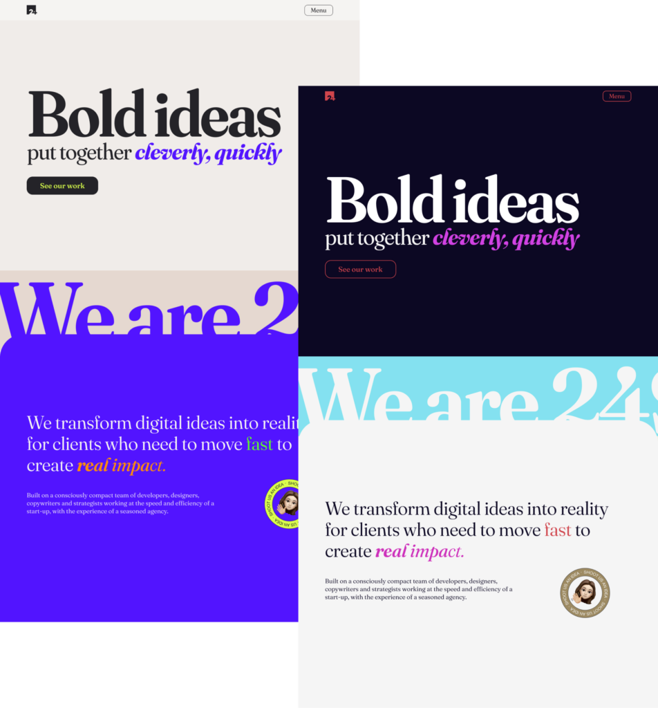

Static websites are out, looking at animations
Using our research and emulating CSS animations using Figma prototypes
After failing to provide clarity by explaining our interactive ideas, I put together a small presentation of the research we pulled, along with creating basic prototypes in Figma to show exactly how a more ‘custom’ animation should look i.e. how a button should animate when hovering over.Close communication with developers to ensure a smooth transition
Working closely with our developers. We jumped on calls and guided them through any inconsistencies/questions. This became really important as detail was really key here. Animations that seem too slow or too clunky can seem half-baked. I wanted to ensure we had something really fluid.The final draft

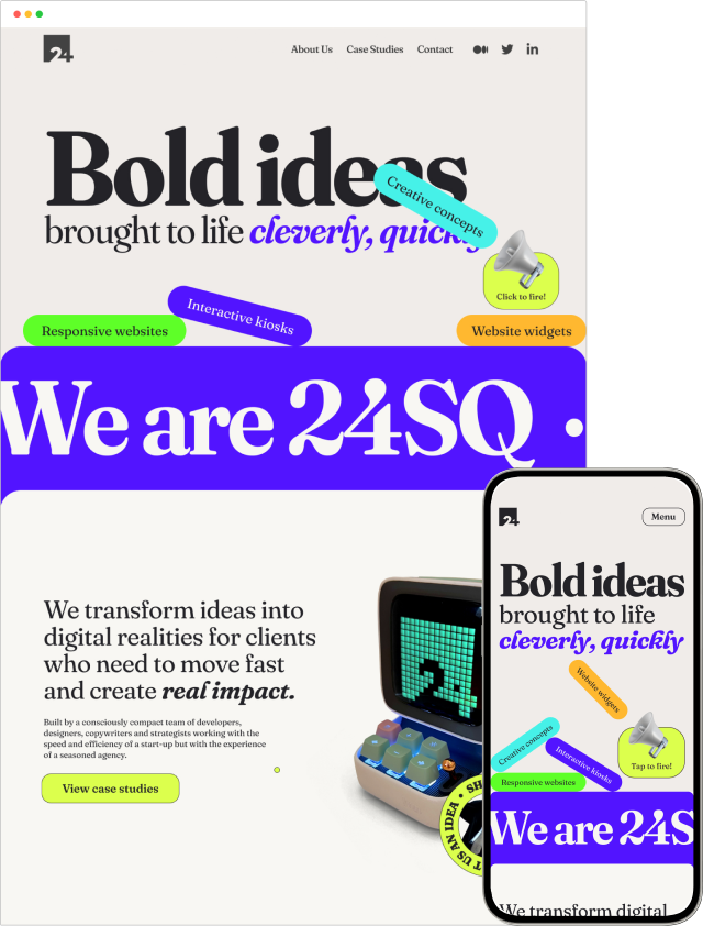
Phase 1 launch!
Phase 1 is now done, head over to our new site and see its capabilities. Because of time constraints, we’ve launched without some animations in place, as we’re finding Framer can be quite limited with bespoke builds. There’s also a small prototype that allowed us to visualise some of the animations but there’s still plenty of interactions we want to include.
Roll on Phase 2!
Moving forward
Learnings
 Really research every aspect of a concept before getting buy-in
The idea of using variable type really excited me, I knew we needed to head down this direction. However in hindsight, I needed to spend more time on researching all potential limitations that might come up. We found a great typeface that worked, but providing options of designs became difficult when tunnelled in with very limited choices of other typefaces. Additionally, researching in better detail exactly what can be done with animations using a specific typeface’s axes would have been key. We found animations with Fraunces are good, but not as ‘free’ as some of the expensive options. Knowing this early could have provided us with freedom to pivot, even on a tight timeline.
 Less is more when it comes to researching ideas
It’s easy to get overly excited about designing something with no limitations and originality, however with that comes a paradox of choice. Too many ideas and I became too indecisive on what direction we went in.
 For heavily visual ideas, explanations sometimes don’t cut it
Presenting ideas in front of a team required a bit more effort. I did well in communicating the concept, the direction and the visual elements and how the site as a whole worked, but I found it a lot easier creating basic Figma prototypes to showcase animations, rather than to explain them.
 Framer is a really powerful tool, but it's young and needs improving to keep up with standards
As a designer, Framer proved to be really good! I could jump in and play around with fixing minor issues that would typically take a lot of admin time creating bug tickets for, however it's quite easy to break designs and has some issues with not having its own CDN, a limited bespoke design using custom CSS unless you pay a high price (tiered price system) and a few other specific development issues that are standard on WordPress. But, as a collaborative tool and as a designer, I loved it.
